Dazzle, Dapple, Fizzy, and Pixel

I figured out pretty early on, age 4 or 5 maybe, that if I rubbed my eyes enough and then closed them I could see rather colorful kaleidoscopic afterimages that would change a bit each time I blinked. Similar effects were happening on the ground beneath leafy trees on sunny days, in the sky during fireworks displays, and swirling on the surface of soap bubbles. A thing was always changing in really cool ways, yet remaining that thing. See also: rivers, clouds, cities, living bodies, the proverbial ship that has had all its parts replaced over time. Those awakenings came later, but my fascination with all things dazzled, dappled, effervescent, morphing yet static, started early on.

Exploring these phenomena is a core driver in both my visual art and, to some extent, my music. Yes, I am working with pattern and density and often color, but my desire is to depict the dance of simultaneous change and stasis, whether it be a contained entity or something that could continue on in all directions forever. Making the ephemeral more permanent, a common goal of an artist, is also part of it. Freezing the soap bubble in time at the height of its beauty.

Easier said than done. I’m not a realist, so I employ more abstracted forms and try different approaches in my attempts to achieve said dance. Limiting myself in terms of shape and pattern types—a maximal minimalism if you will—helps to tie a piece together to keep it from becoming a mishmash of psychedelic soup.

“Soap Bubble” (2012)

“Soap Bubble” (2012)

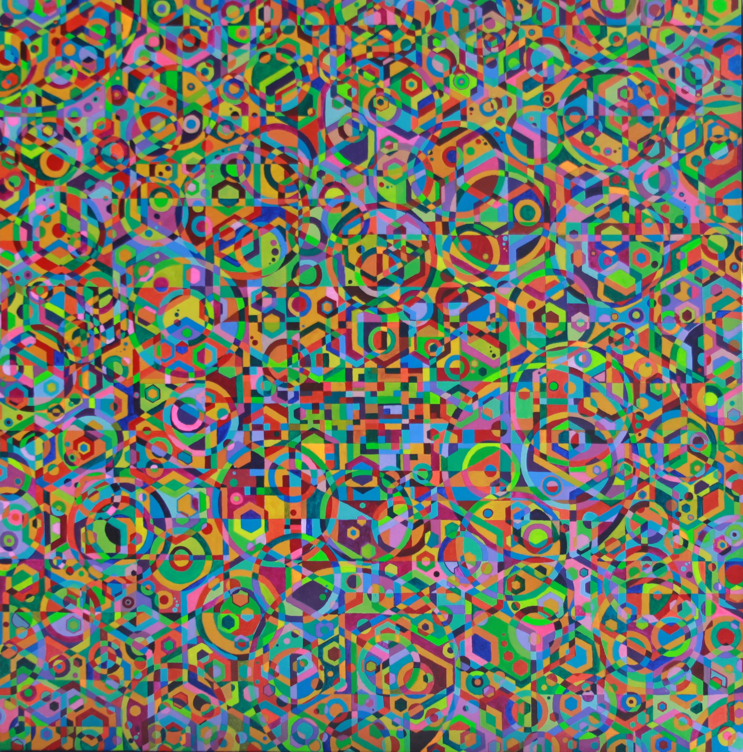
“Emergence Refraction” (2017)

“Emergence Refraction” (2017)

Cumulus" (2014)”

Cumulus" (2014)”

“Surfacing” (2014)

“Surfacing” (2014)

Over the past few years I’ve had the urge to get more 3-D. What if these shapes could emerge from the 2-D plane? That effort may have begun with my adventures in painting dowels, something I did between other projects or when I was stuck. Not sure what to do next? Paint patterns on a dowel. I really should write a separate blog post about the dowels. They are in some way a gathering of potential that has yet to be fully realized. I’ve got like a hundred of them at this point. They have, however, led to my painting of square (4-sided) dowels and their incorporation into many of the mixed media pieces later on in this post.

“How It’s Gonna Go Down” (2015)

“How It’s Gonna Go Down” (2015)

But I get ahead of myself. One of my earliest 3-D pieces was “How It’s Gonna Go Down,’ a mixed media piece about climate change. It literally emerged from the wall as it was being swallowed by painted cellulose waves. I wanted to go more 3-D after that. See Blog post 4April 2018, the story behind the making of “Vibration Lands,” After THAT huge project, I reactively started making smaller pieces.

“Vibration Lands” (2018)

“Vibration Lands” (2018)

Messing about with drawing semi-random right angle geometries on paper, I cut then them out and constructed objects that seemed to suggest modernist houses, thinking that maybe I could eventually cut such forms out of opaque white plexiglass to make modular lighting fixtures.

IMG_0526 copy.JPG
IMG_0530 copy.JPG

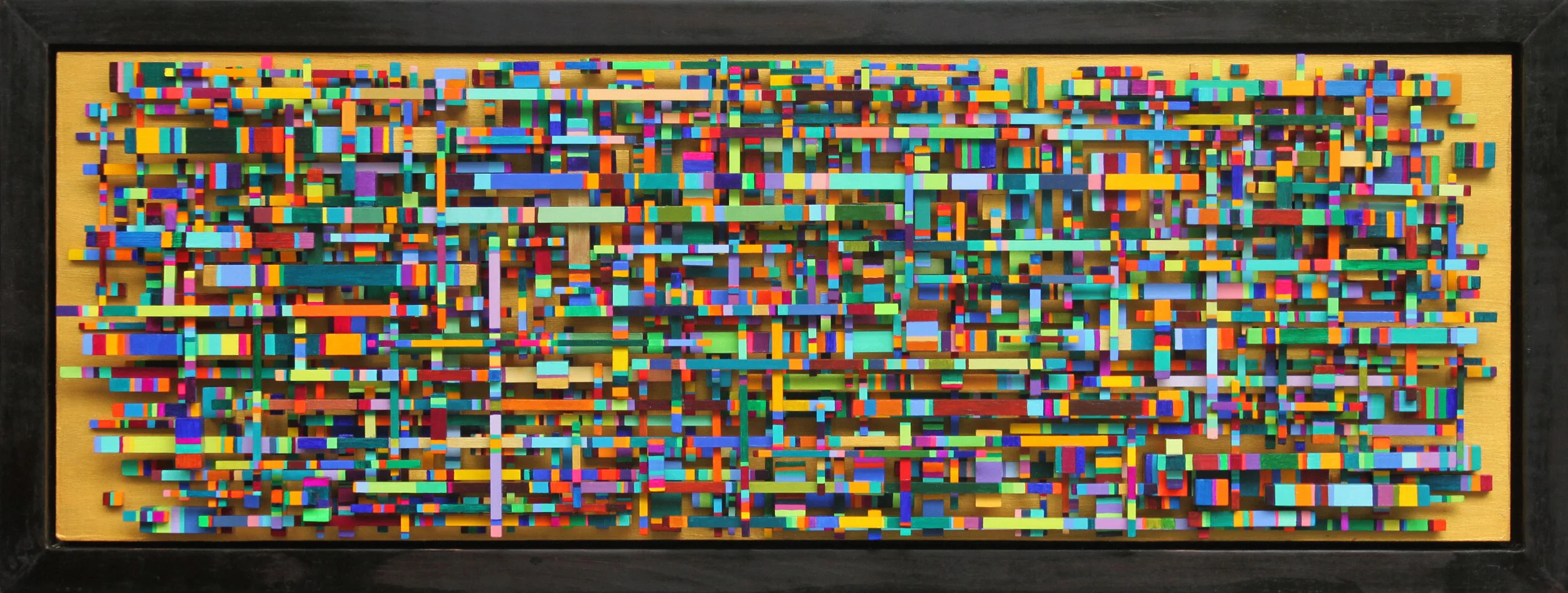
A still-intriguing idea, but I got sidetracked, or at least differently-tracked: the paper cutouts got smaller, and I began to tinker. What emerged was a kind of maximal minimalism that suggested labyrinths, terraces, medina quarters, unknown depths, pixelated data arrays of unknowable meanings, leaves, petals and other organic strata (painted paper cutouts which I affixed to hidden wooden stilts.

“Peeling” (2018)

“Peeling” (2018)

Data Filed I” (2018)

Data Filed I” (2018)

Data Filed II” (2018)

Data Filed II” (2018)

“Data Filed III” (2018)

“Data Filed III” (2018)

Data Filed IV” (2018)

Data Filed IV” (2018)

“Data Filed V” (2018)

“Data Filed V” (2018)

I’d like to create some much larger pieces based on these paper constructions, but using sturdier materials like wood or even metal. The paper can be fragile and people seem to want to touch them (sometimes to the point of damage). Given the detail involved, I’m thinking laser cutting may be the route forward. Joining Nextfab and learning to operate their laser cutters and associated programs is high on my post-pandemic to-do list. I can see incorporating any number of my previous patterns into this design scheme.

In the mean time, my painted square dowels have become shorter, and I’ve started massing them in a somewhat similar fashion to the paper data fields.

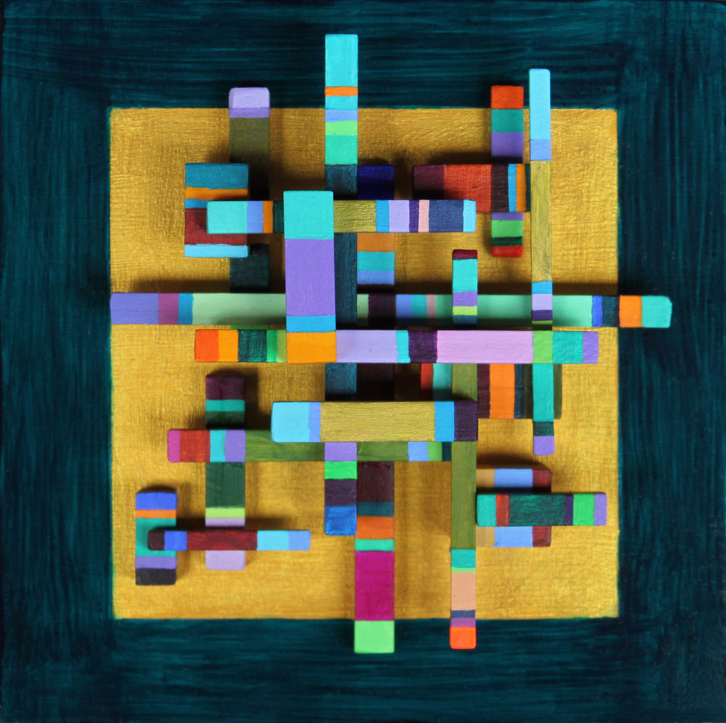
“Little Cloud IV” (2020)

“Little Cloud IV” (2020)

“Inner Space Station” (2020)

“Inner Space Station” (2020)

They first emerged as small, discrete arrangements, like a passing cloud formation. As I make these I feel like I’m creating little urban modules or neural clusters that want to be connected like cities or molecules. Perhaps even my blog posts have their own invisible connectors of idea and theme. I have the urge to draw way-finding arrows between blog texts and map it all out, connecting and highlighting the idea bubbles as they form and pop. My own personal Lego of art and words, caught in mid-morph. Am I getting closer to dancing about architecture? That, or am certainly in need of some social contact.

“Problem Solved” (2020) - Best viewed while listening to Terry Riley’s “A Rainbow in Curved Air”
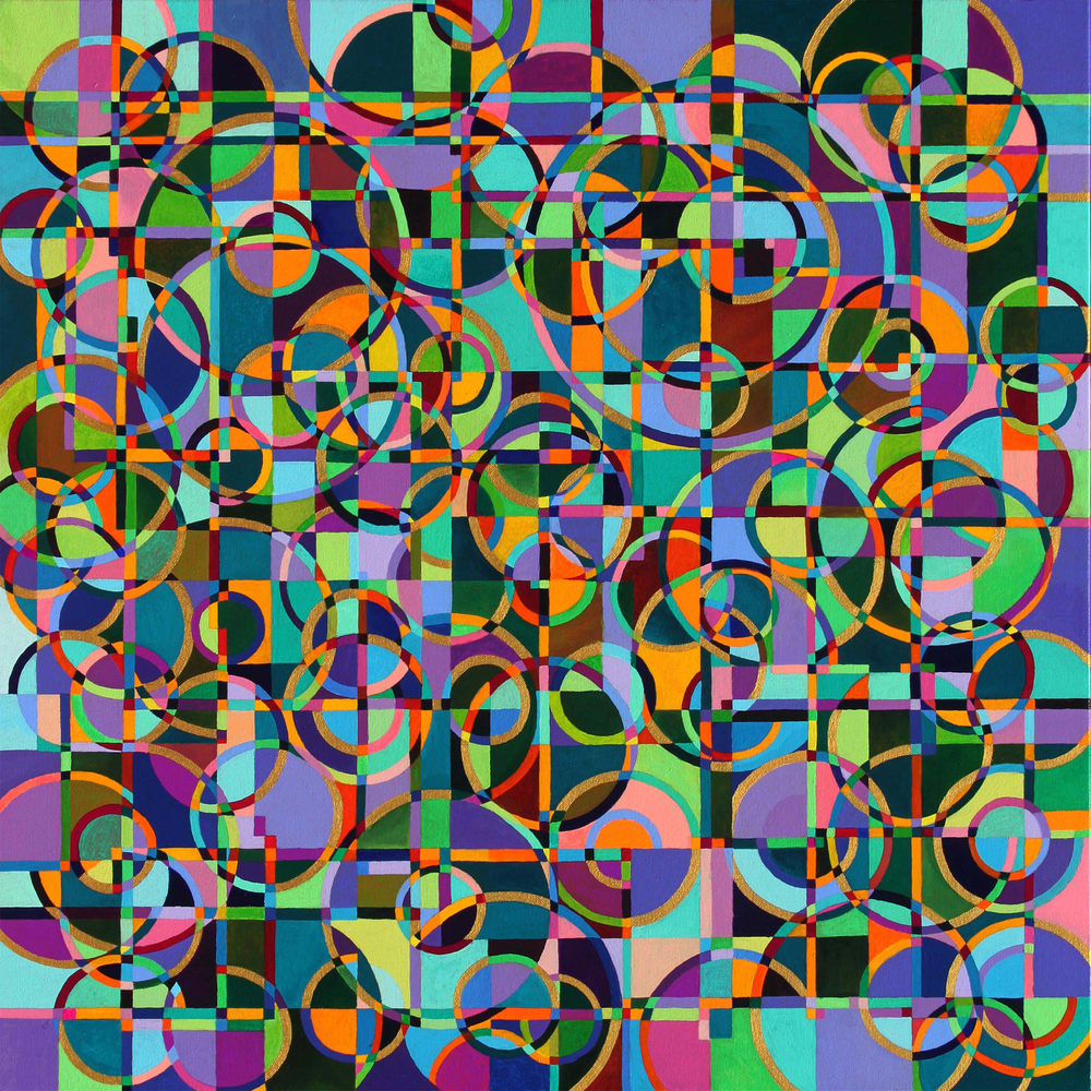
“Problem Solved” (2020) - Best viewed while listening to Terry Riley’s “A Rainbow in Curved Air”

Honey in the Hive

Honey in the Hive


Art supplies emit potential art energy. It’s impossible not to detect their vibrations when you notice them. It follows that the glowing center of that energy galaxy is an art supply store. Behold the prismatic array of various brands of paint, spinning there like hundreds of engaged chakkras on their spotless shelves, calling out to your consumer pleasure receptors. Anyway, it was during one such supply mission years ago in my doodling-during-office-meetings phase that I found the templates section. I brought home one of those little green plastic templates with circles, squares, and hexagons of various sizes (up to about an inch) and started messing around. I was already pattern guy and this tool just furthered my interest in abstract geometric compositions.

“Archipelago” - acrylic on canvas (sold)

“Archipelago” - acrylic on canvas (sold)

“Trellis” - ink on paper

“Trellis” - ink on paper

“Amplifier” - pen and colored pencil on paper

“Amplifier” - pen and colored pencil on paper

Then of course I had to bust out my compass.

“Inner Workings” - acrylic on canvas (sold)

“Inner Workings” - acrylic on canvas (sold)

I became especially fixated on hexagons and how they interacted with one another, with circles and rectangles, stumbling upon their potential for 3D effects. What an pleasing shape. I came to further admire beehives and game boards. Soon I was craving bigger hexagons but large templates for those did not appear to exist. I found a company in Louisiana that would custom cut plexiglass for me, so I designed two hexagon template set and they cut them for me. I was in business!

“Bosphorus” - ink on paper

“Bosphorus” - ink on paper

hexagonal templates

A whole series of drawings and then paintings poured forth. Things got bigger.

“The Rift” - acrylic on canvas (collection of the artist)

“The Rift” - acrylic on canvas (collection of the artist)

“Emergence Refraction” - acrylic on canvas

“Emergence Refraction” - acrylic on canvas

The Early Universe - acrylic on Canvas

The Early Universe - acrylic on Canvas

“Slice of Gear Cake” - acrylic on canvas (sold)

“Slice of Gear Cake” - acrylic on canvas (sold)

“Surfacing” - mixed media on canvas

“Surfacing” - mixed media on canvas

Hexagons connected like the intricate reinforced girder lacework of late 19th century Bridges and arcades. One hexagon drawing connected to three others. The thought appeared: “What if I had 16 connected drawings?” I’d like to have some words with the entity that generated that thought. Turns out seamlessly connecting 16 drawings on paper to a secure backing strata involves a whole lot of unexpected engineering and furrowed brows.

“Supercluster” - 16-panel ink on paper

“Supercluster” - 16-panel ink on paper

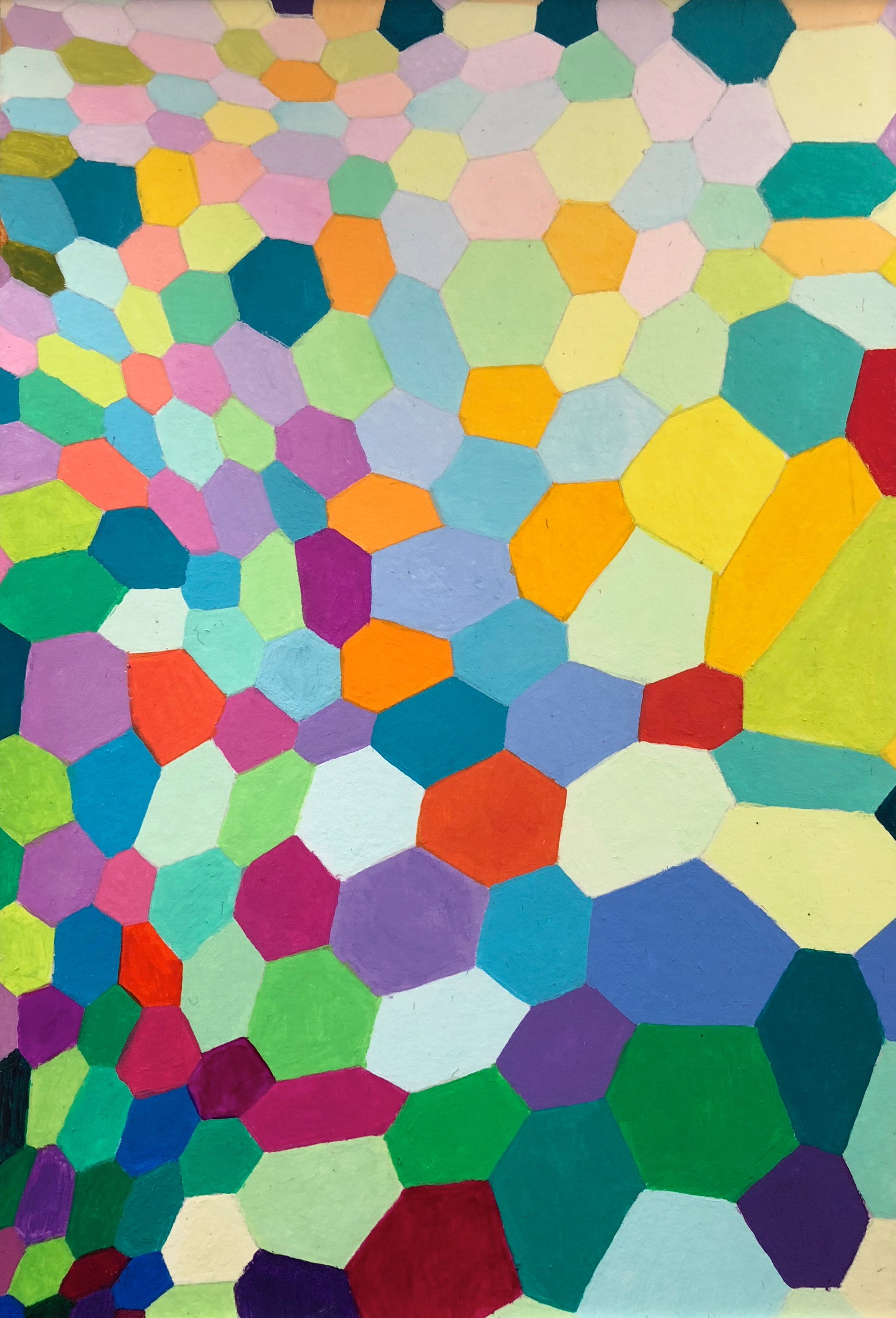
After the massive half year-long “Vibration Lands” project (featuring templates and many of my previously-developed patterns), during a phone call I was messing about with a pen and paper, connecting hand-drawn hexagons. That led to what became the “Freeform Hexa” series of paintings on paper.

“Freeform Hexa I” - acrylic on paper

“Freeform Hexa I” - acrylic on paper

“Freeform Hexa X” - acrylic on paper

“Freeform Hexa X” - acrylic on paper

I found I could sort of vaguely guide the push and pull of the design, as though it were expanding and contracting in places. Fun! I made more, playing with various color combinations. On the tenth piece, I thought to introduce the element of gradients, with a sequence of every other hexagon getting progressively lighter, darker, or morphing into a different color. Whoa. What if I tried a bigger piece like that?

“Murmuration” - acrylic on paper

“Murmuration” - acrylic on paper

Well that turned out great, if I do say so. Such a sense of movement, more so than in my template-based pieces. Ok, then what if I want to go bigger with this free form hexagon intermingled gradient thing? A month later I had a completed canvas and some aching arm hands. Ok! So what if (you can see how I keep getting into trouble) I connected it to another one? Another month and so much paint later:

“Symphony Wave” - acrylic on canvas (diptych)

“Symphony Wave” - acrylic on canvas (diptych)

So many, many waves of choreographed dancing hexagons (and a few errant pentagons and septagons). Must take a breather from all this painting. But I do like this process. How about trying it using my old pals, the colored pencils? And what if the waves were more wavelike?

“Plume” - colored pencil on paper

“Plume” - colored pencil on paper

Rescuing Strays

I often cogitate on items that pile up in the back of a desk drawer, psychically and actually, little forgotten things, cast-offs, marginalia, ephemera, detritus, afterthoughts, odds ‘n’ ends, doodles made during phone calls, etc. After several months of painting sticks and dowels I needed a break, a common reactive about-face for many of us. What if I created a piece using items like these that I’ve got lying around in folders and in the back of my mind desk? So I did. I’m rather pleased with the result. I like to think it honors and elevates the worth and beauty of quickly-forgotten stuff, or at least the items that found their way into this piece.

“Rescue Collector” - mixed media on canvas, 14” x 20” x 2” - 2020.

“Rescue Collector” - mixed media on canvas, 14” x 20” x 2” - 2020.

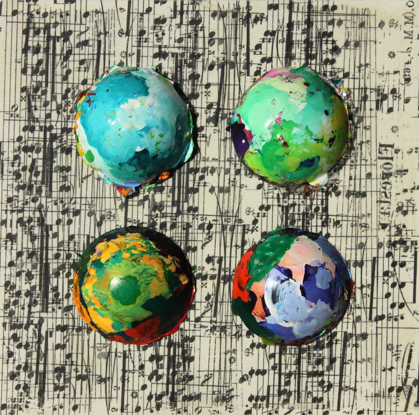
The circular “buttons” are reliefs made from the excess paint that accrues in my plastic palette tray over time, dried acrylic normally tossed that at some point I noticed looked pretty cool when I peeled it off the tray. Generative art I hadn’t realized I was making. To keep the semicircles from collapsing I poured resin into the painted plastic palate and chiseled out the dried forms to use in the future for...something. I kept them in a cardboard box. As I made more buttons over time, I introduced a bit of intentionality here and there, painting directly on my tray receptacles. The buttons often emerge looking like semi-precious stones, or planets from space. They look like something to be collected. I gave them each names.

The buttons made their first appearance in my piece “The Beatles”, which, come to think of it, was a bit of a trial run for “Rescue Collector’ in terms of my process.

“The Beatles” - mixed media on panel, 2019

“The Beatles” - mixed media on panel, 2019


In “Rescue Collector,” a now barely seen grid of earth tones was originally to be a field of little frames for each button in the collection, but they came out looking like an ugly sweater from the 1970’s, so I put several washes of the palest greens, purples, and Iridescences over it. Getting there. Then I thought to cover the surface with ink transfers from other saved ephemera, mainly my ink doodling cut out from notebooks/other discarded false starts, along with some of my dad’s crumbling sheet music (some Chopin in this piece, complete with dad’s scribbled-in fingering markings). I even made some more small doodles when I ran out of appropriate older ones to use. To make an ink transfer, I affixed the paper with the image on it to the canvas with clear acrylic medium, and when it dried, wet it and carefully rub off the paper, destroying the original in the process. A bit odd to spend a few hours making a drawing to then destroy it, but I guess a Buddhist monk mandala mindset is the way to go in this instance. Not all the ink from the originals survived the rubbing. The fragility and entropy are present at creation, as it were. Cool. I then added colored pencil to the background, a bit of a nod to my coloring book period. I was just trying to create some depth with all of this for the buttons to float upon and it came out so well that I may attempt a larger piece with this process, sans buttons. I I like how the ink transfer process reverses an image, creating a kind of through-the-looking-glass-into-the-past effect. I’ve used my dad’s piano sheet music in a bunch of my artwork over the last 8 or so years. It keeps him and his music present in my life. I’ve lost several family members over the past decade and so it seems inevitable that the vagaries of memory have become a theme in some of my recent work.

Increasingly, I’m paying attention to the side edges of my pieces. Highlighting the typically liminal. They’re part of a viewers experience, after all. Gives you something extra to consider when you’re laying on the couch looking up at it. Unseen continuations made visible. Anyway, my little ode to memory, underdog feelings, and up-cycling.

A word about the titles. I collect them. They’re little word baubles rescued/trash-picked/harvested from my fleeting, daily encounters with them; in print, passing conversations, the ether in my head. Some become song titles, some art titles, some lay in wait for their chance to be known. I used to use them in song lyrics, when I was writing lyrics for my bands with singers. Maybe again someday. When I assemble them in a list, they read like kooky Dadaist poetry. For “Rescue Collector” I printed out a bunch, cut them into little specimen labels, and tried to match them with the buttons, essentially treating each button as an individual work of art to be named. Not quite like naming discarded hair weaves one finds in the gutter, but perhaps close.

In reading order they are:

Rescue Collector - detail.jpg
Rescue Collector - side view.jpg

Return Audio Device
Novelty Bias
Burner Phone
Stick The Landing
Appears Larger
Charged Particle
Raised Eyebrow
Gas Giant
More Heat than Light
Bird Colors
Flat Meaning
Continuity Error
Optimal Flavor Profile
Makeshift
Trouble Ticket
Joy Fatigue
Babblefield
Luxury Metadata
Lost Noise
Relaxation Tape
Mind Room
Rare Visitor from Eurasia
Butter Notes
Eyeball It
Story Checks Out
Long Haulers
Misprint
Bottle Cap
Friend Typing
Hard Want

Art in the Age of Mechanical Reproduction

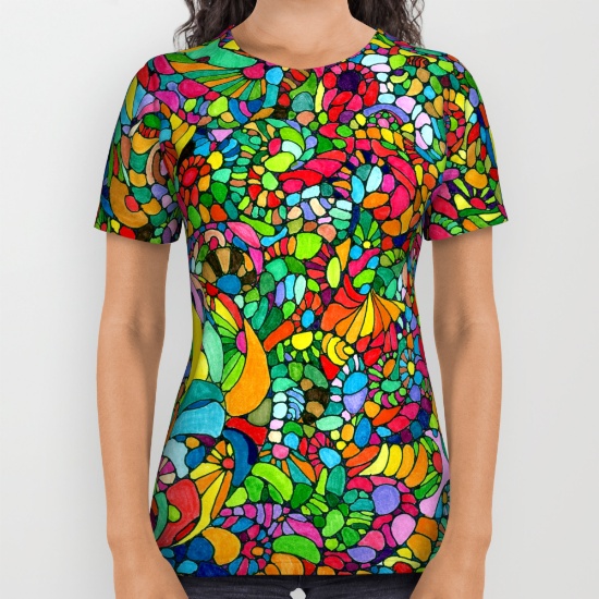
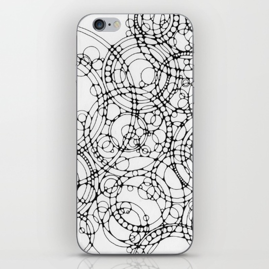
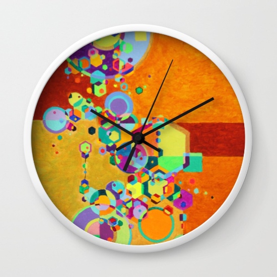
After much encouragement and assertions that many of my designs would look rather fetching as skins to various consumer products, to wit and behold:

after-leger-cards.jpg

I chose eleven of my creations and have been uploading and positioning the largest files I can generate onto the Society6 platform. So click on through here and see what you like. Society6 is known for their high quality printing and products as well as top-notch customer service. If you purchase prior to December 14, your items should arrive by December 25th. There are also coupons and frequent sales for Society6 floating about their site and mailing lists. Their search engine doesn't seem to favor newbies for some reason, so find my stuff through the links above. If you are feeling spunky, perhaps even click on the "like" hearts by each product you fancy and tell your friends that their lives could be filled with pop art psychedelia if only they'd open their m̶i̶n̶d̶s̶ wallets. 

Dreamtime Return

Where the micro hits the macro.


After a 7-month pause for working on the coloring book, I declare this painting finished. I had just begun to play around with some of the freehand forms that have appeared in my drawings when opportunity struck. The painting waited patiently on its easel while I worked with black pens and looked longingly at color. 

Title: "Topographia." Otherwise, the title would've been something like "Topographia Vietnam Chakra Intestinal Terrain Chi Interior Macro Battle Adjustment: Tactics, Strategy and Alignment Continuum."

Acrylic on canvas. 12" x 36"
 

It will be on display at Renaissance Healing Arts, 1004 Pine Street when I get it together to drop it off to them.